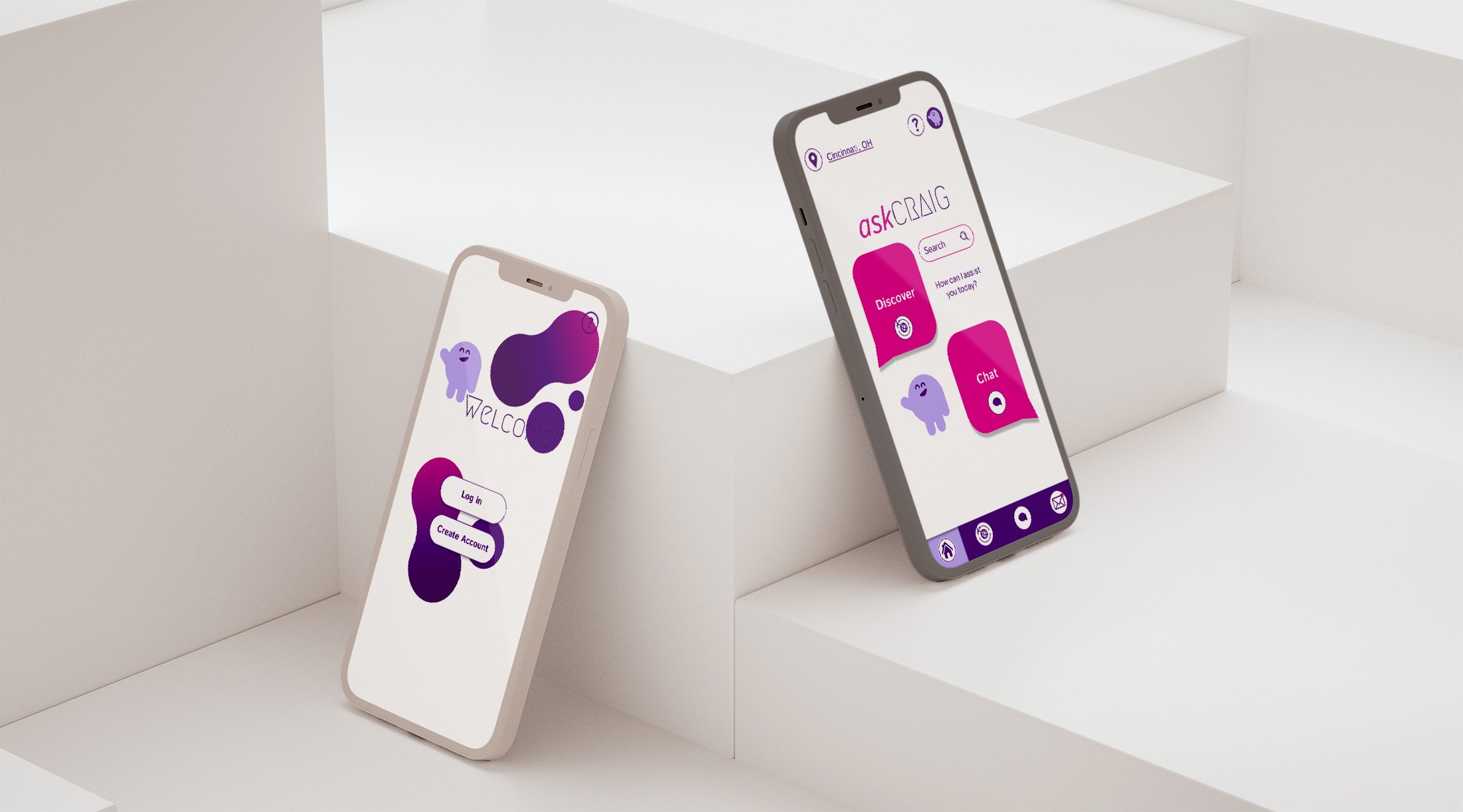
Ask Craig, Craigslist App Re-Design
Craigslist is a shopping app that can help users find anything they are looking for including housing, furniture, and even toys. The app as it stands has minimal design and lack of hierarchy.
The re-design allows for a chat feature as well as easier direction of task flows. The app has a high tech feel to showcase the new tool features.
Benchmarking
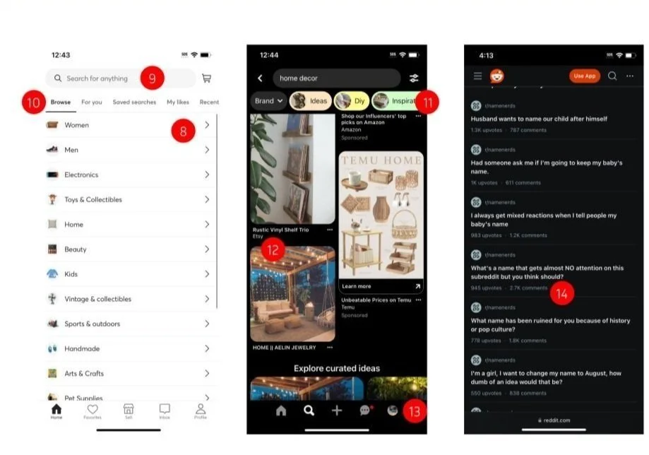
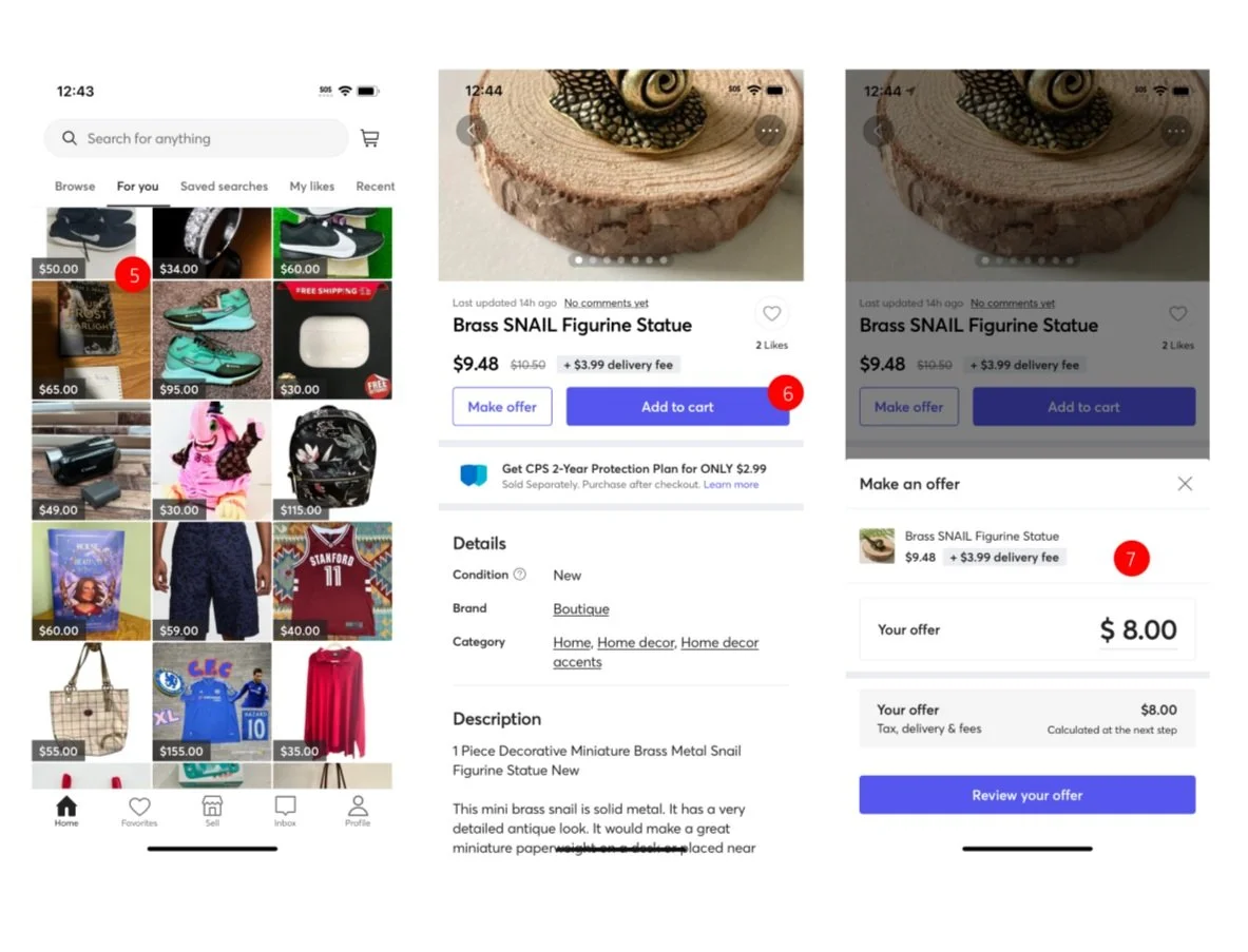
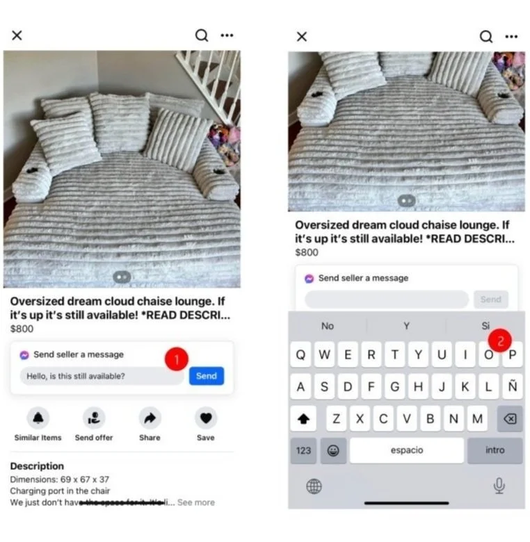
To begin, research was conducted to discover the best format for different attributes of the website where design adjustment was needed. Looking at details in Pinterest, Facebook, and Mercari.
Task and User Flows
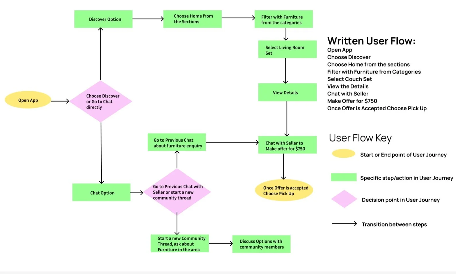
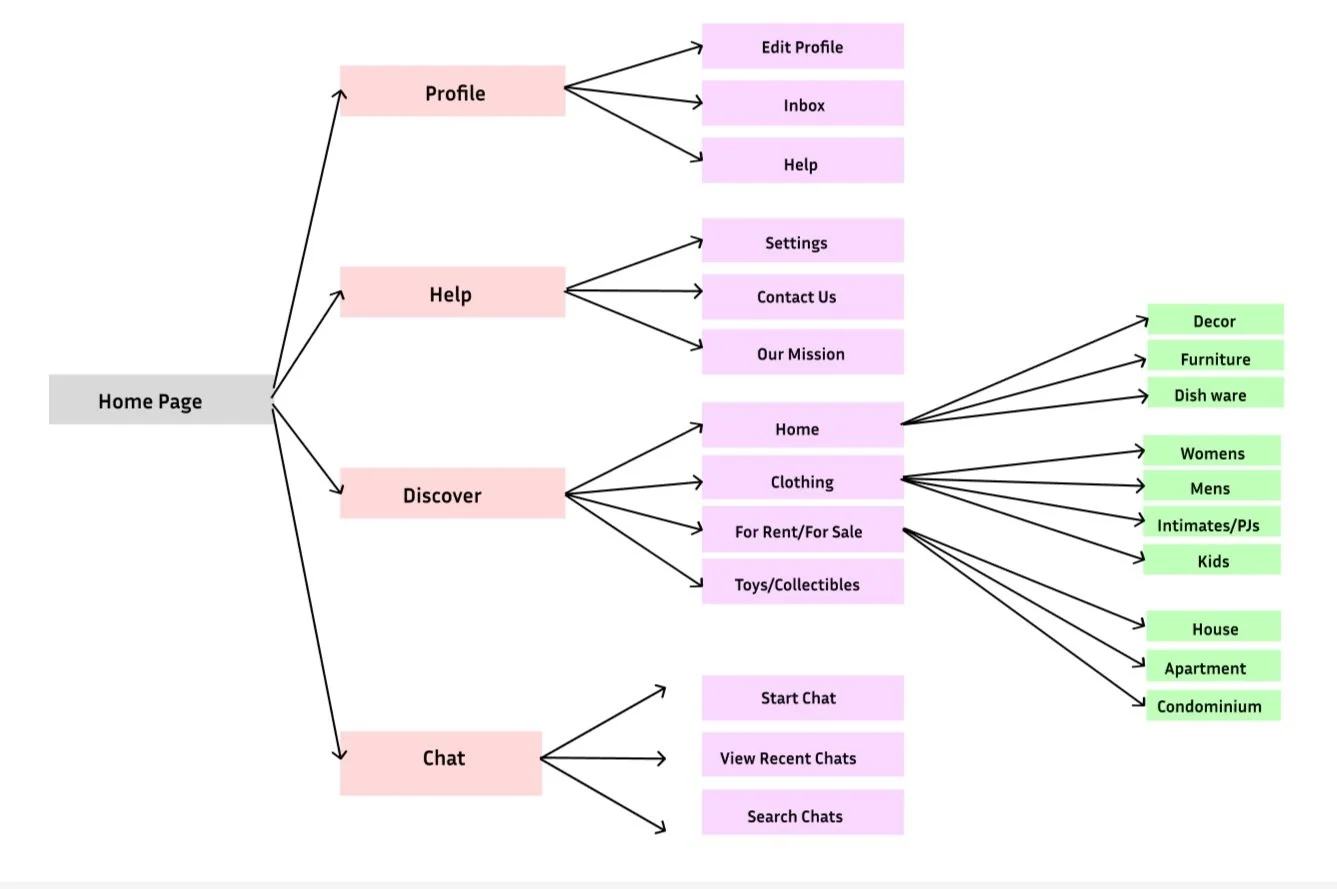
Task flows and user flows were used to create a map of how the user might interact with the website. These were then taken into consideration to help develop the user persona and continue website research.
User Persona
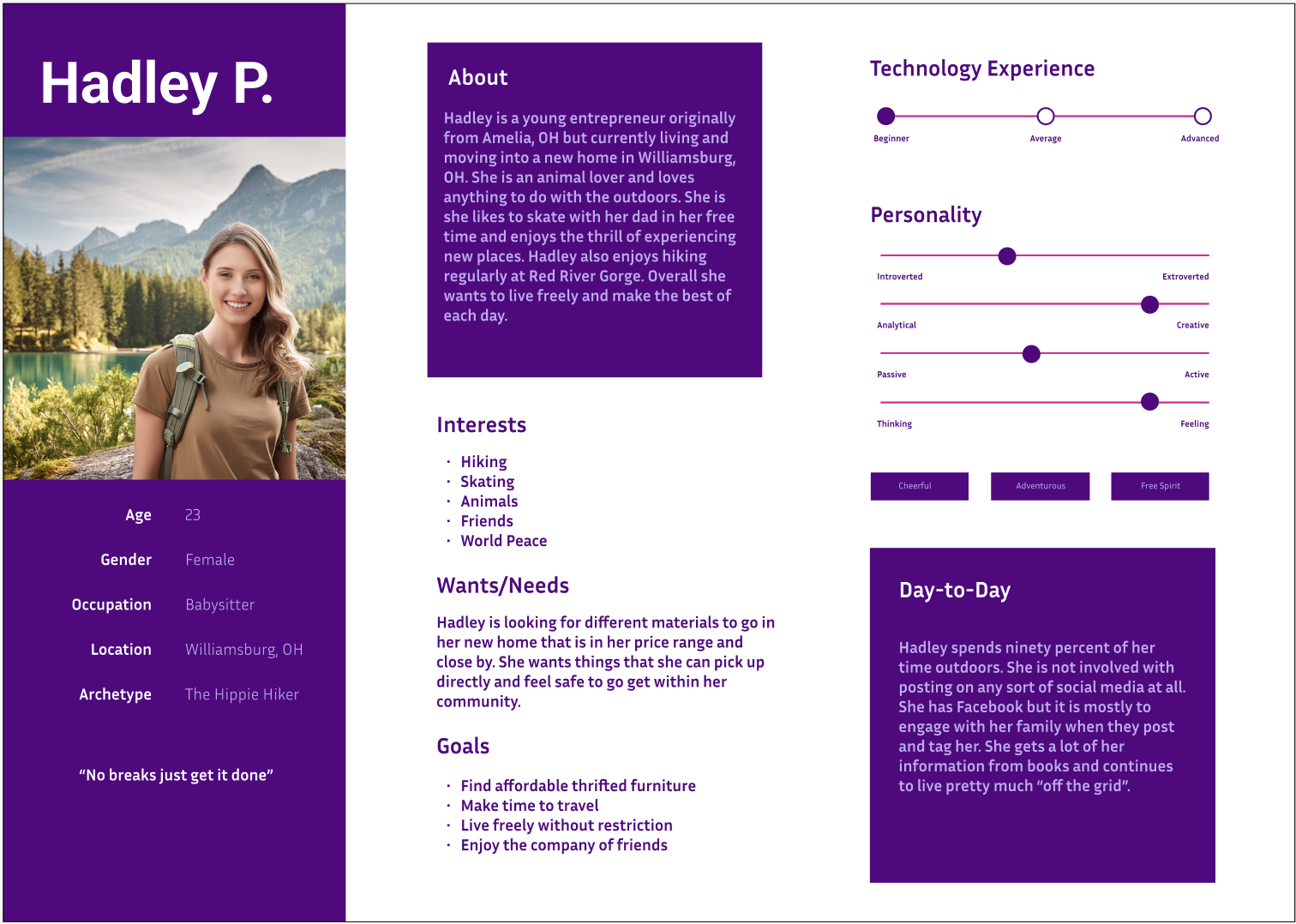
A user persona was made and used to discover where areas of the website might need adjusted as well as how the website could be best formatted to fit the needs of a consumer who is likely to use the app.
Information Architecture and Card Sorting
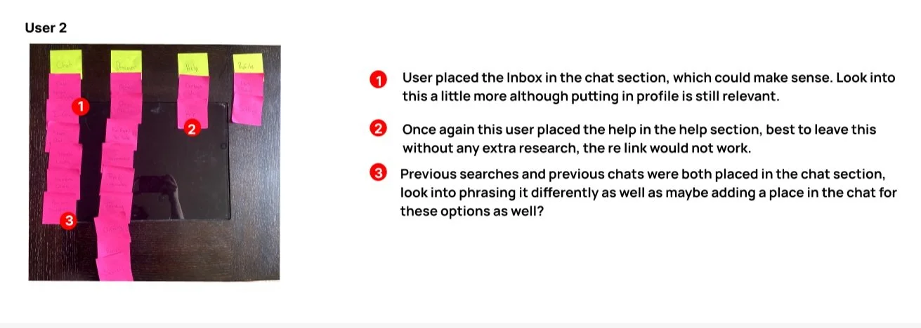
After a persona was created, using the already existing information architecture card sorting was done to discover what a user might perceive is the best way the IA could be structured and that was taken into consideration for the re-design.
Initial Paper Prototype Sketches
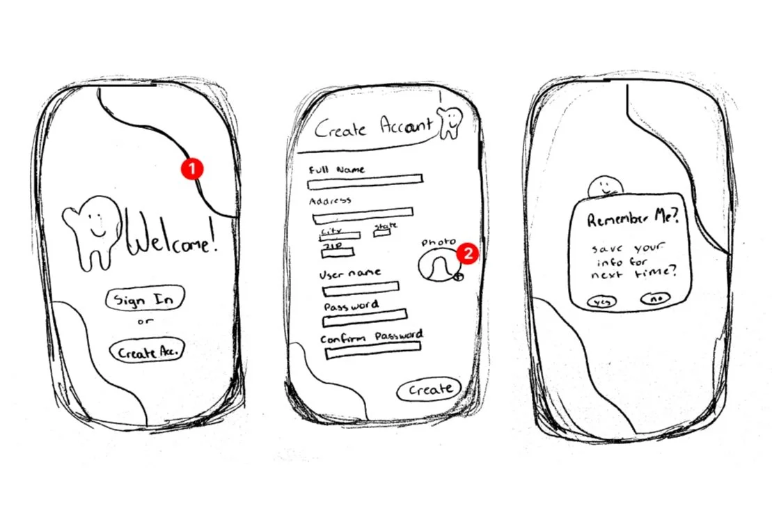
Sketches were created based on card sorting and aesthetics that needed developing in the website.
Initial Paper Prototype Sketches for User Testing
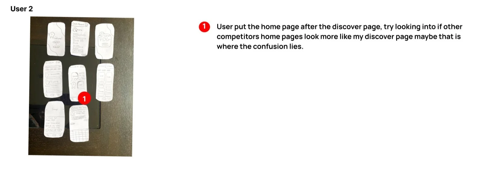
The initial prototype sketches were taken to the user to discover how they might set up the task flow based on the sketches they were given. The results are as shown below.
Low Fidelity Wireframes
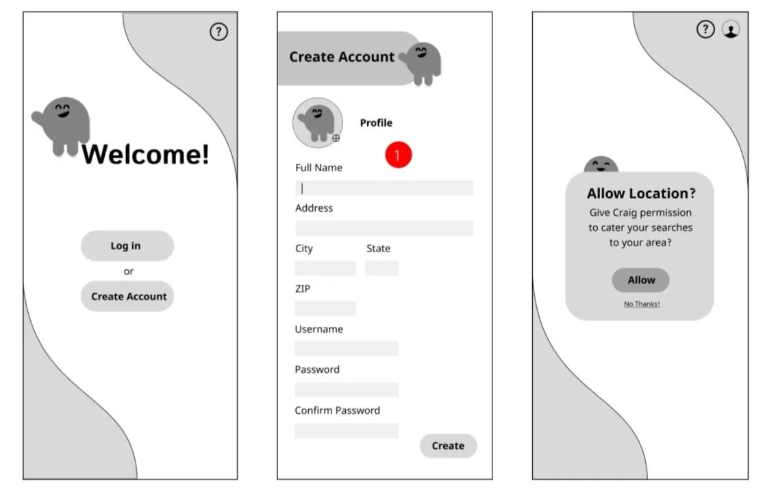
The initial exploration of the wireframes was done in grey scale and orientation and proportion were taken into consideration for the majority. Details were benchmarked and adjusted later on.
Final Low Fidelity Wireframes
After taking into consideration some of the callouts that were discussed adjustments were made and final low fi wireframes were developed.
Mood Boarding and Style Tile
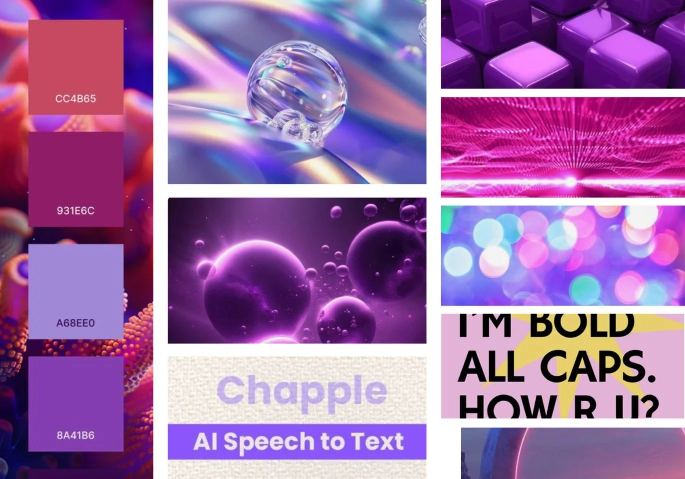
A mood board was created and a style tile was created from that mood board. The colors were there to reflect the ai/high tech feel of the app re-design.
Style Guide
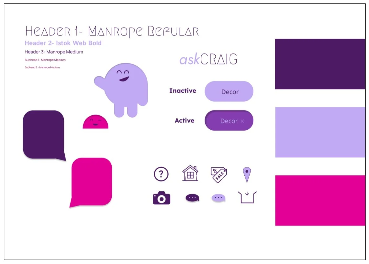
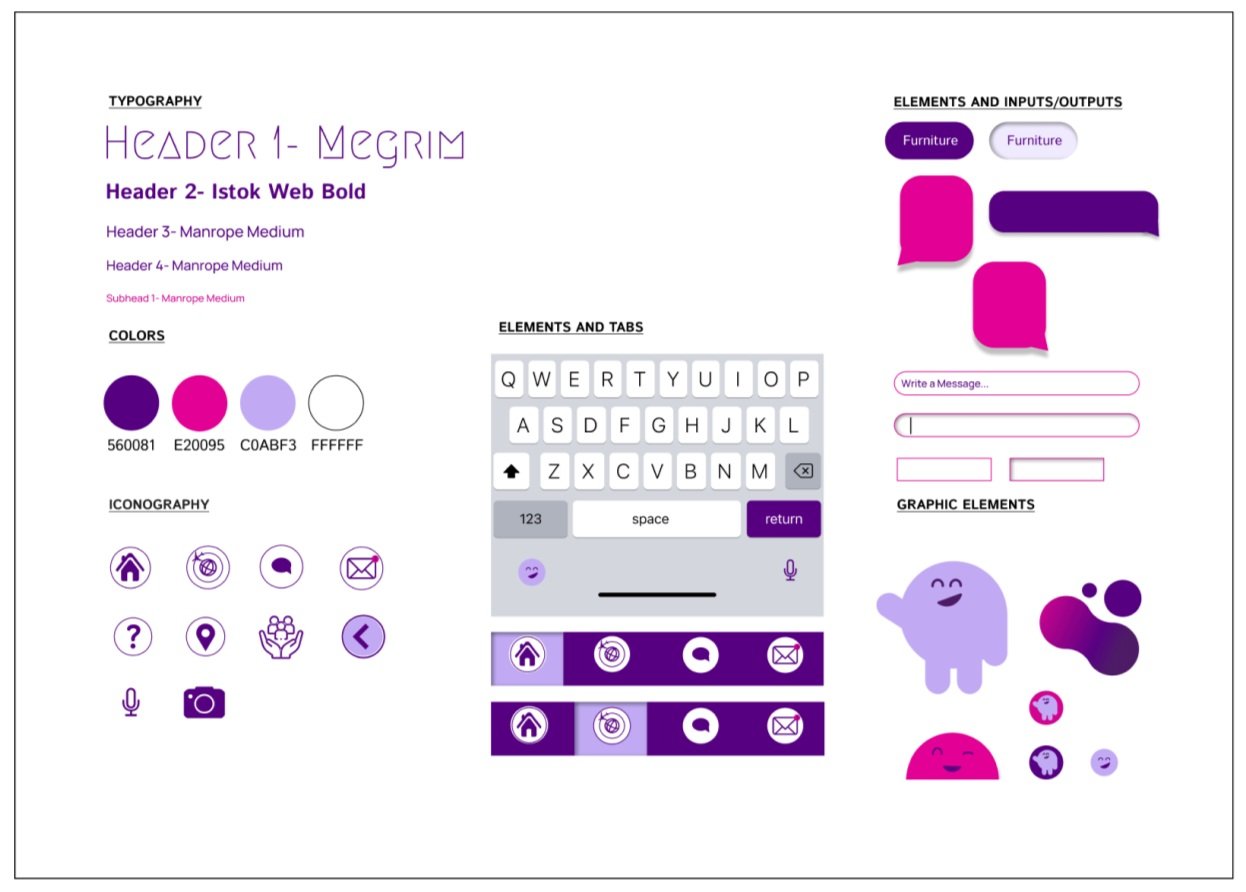
From the style tile created previously, a style guide was made to determine fonts, colors, components, and anything that had a very specific look that needed to be called out.
Color Exploration
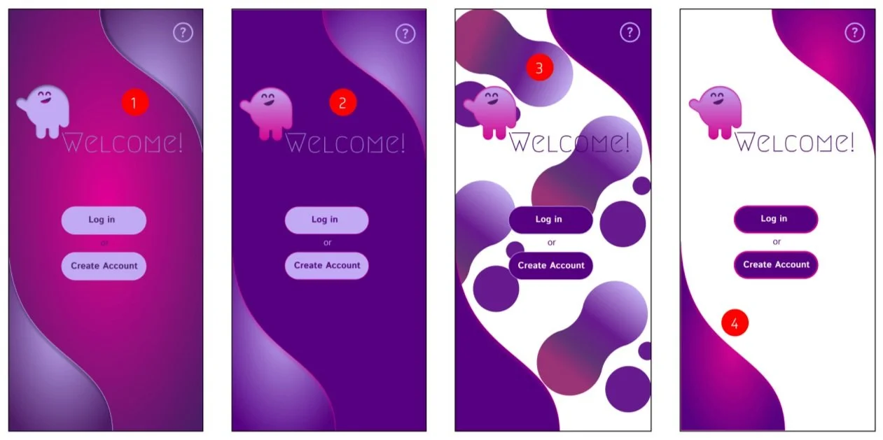
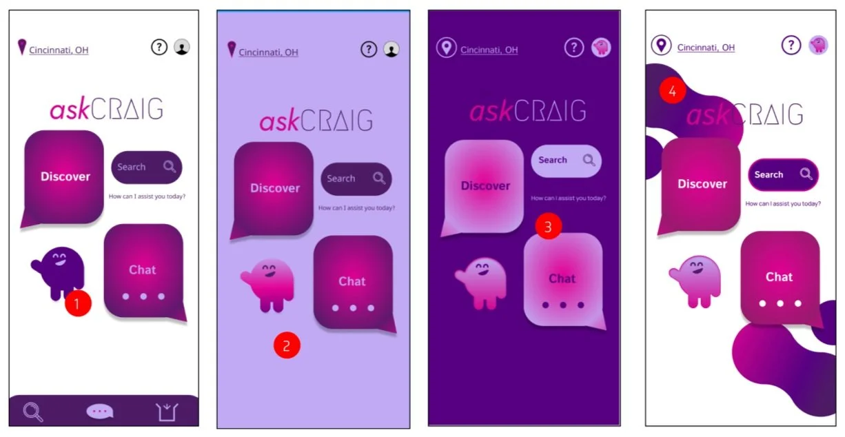
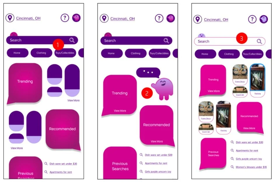
Color exploration was done to determine the best layout for the colors chosen. Aesthetics but also accessibility and readability were taken into consideration when deliberating and settling on a decision.
Color Option Decision
After some tweaking and much deliberation a color system was decided on and created for the entirety of the re-design.
Final Prototype
