Rumours LP Reimagined
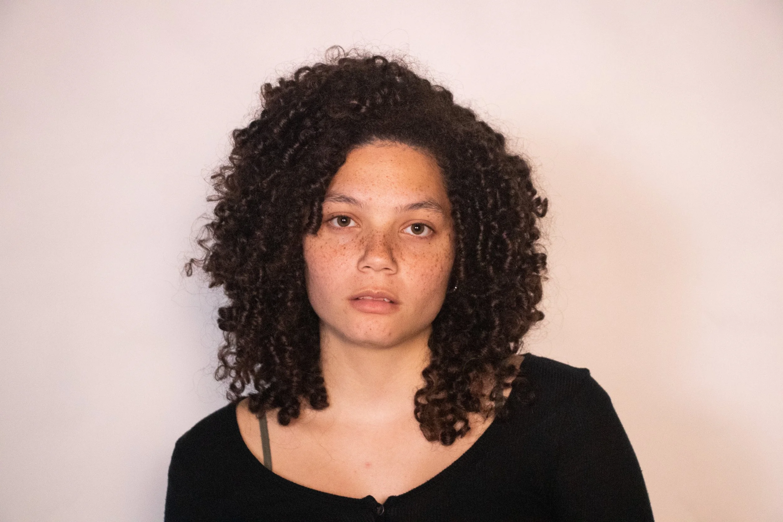
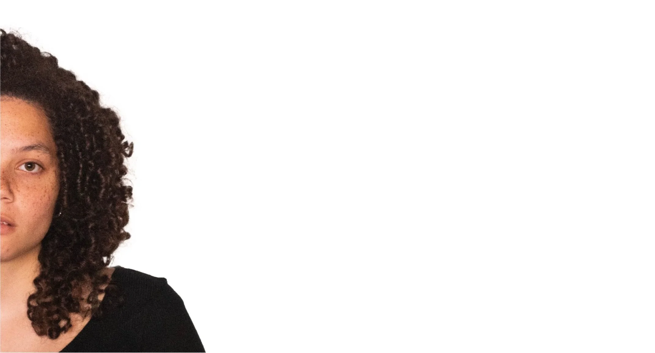
For this project an LP was chosen and reconstructed how I would see the art of the album through photography. For the most part I knew that I was going to pick the Rumours Album simply because I could imagine a rumor as a different image metaphorically.
The project called for the incorporation of typography choice. Overall, the project is one that I had creative liberty over and one that I was encouraged to be experimental with.
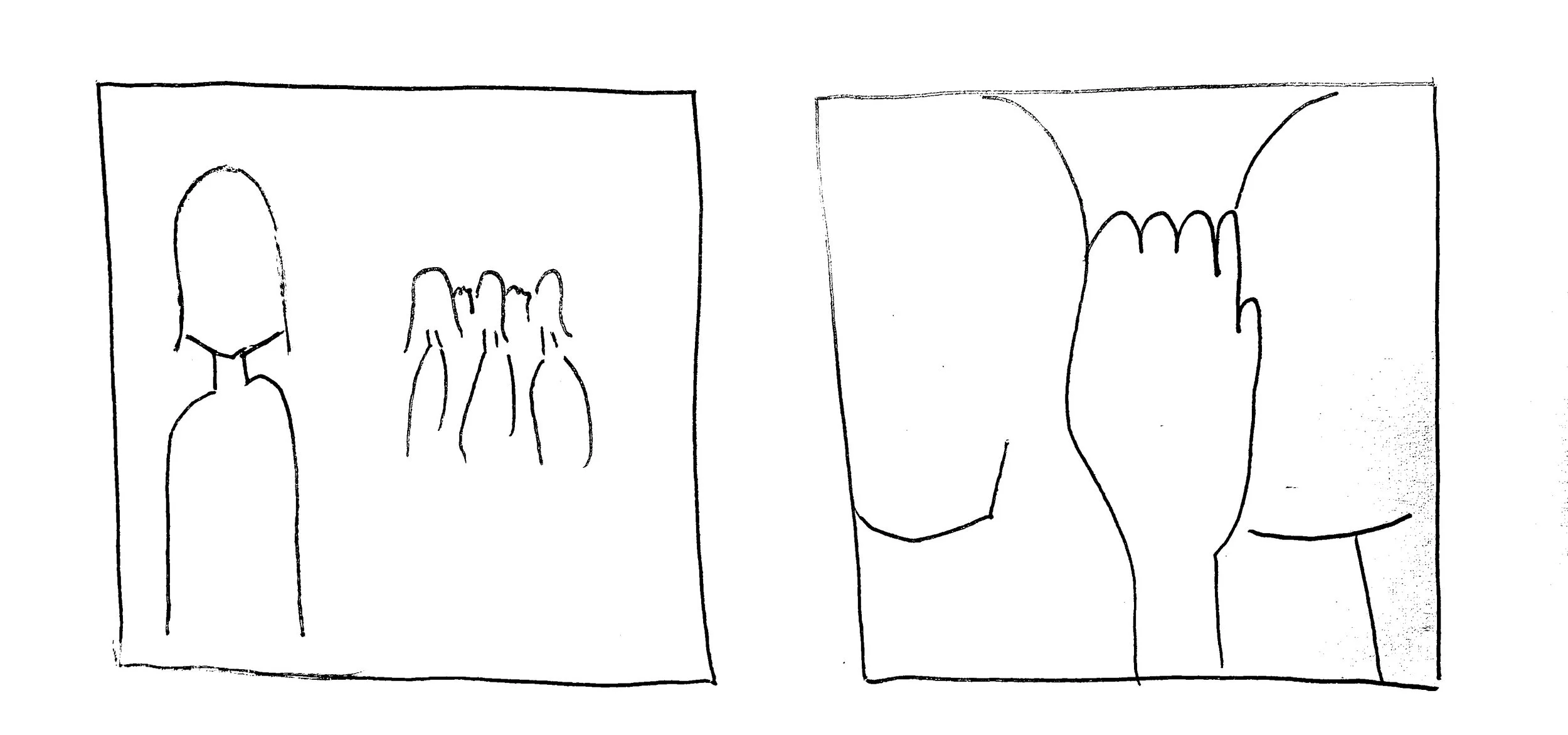
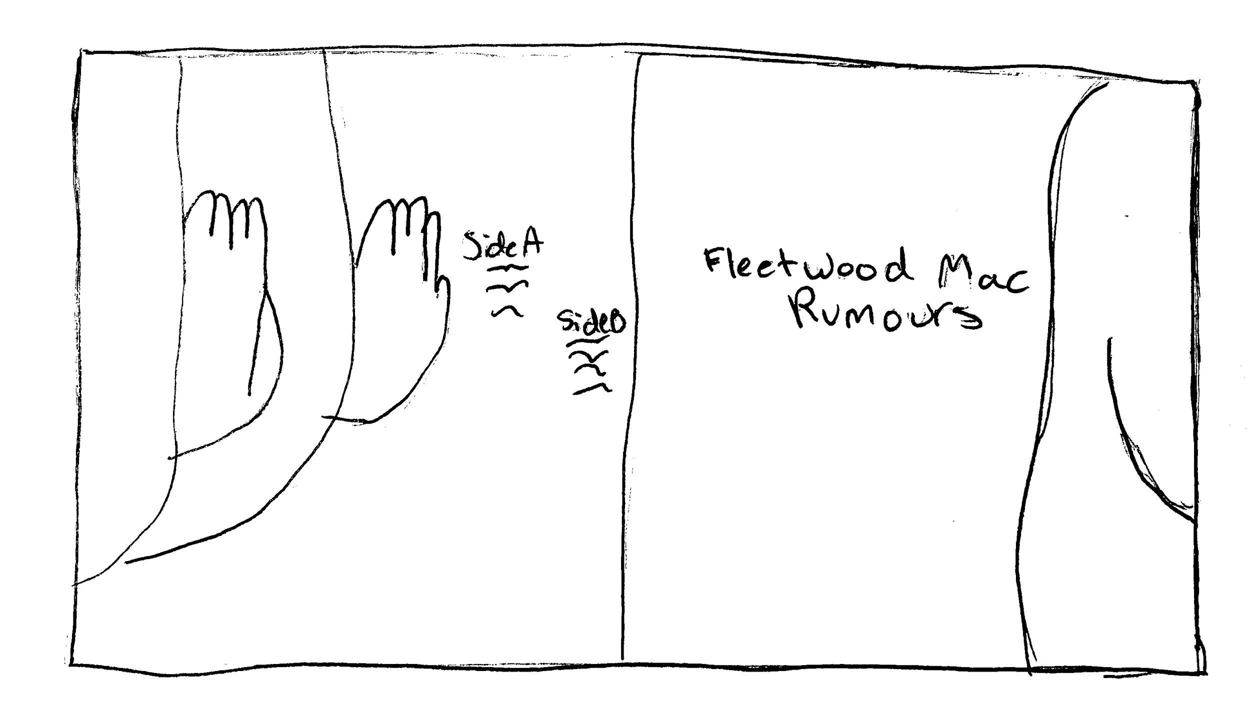
Two Concept Directions:
First
Literal
No centerfold
Direct
Initial Experiment
Second
Symbolic
Centerfold
Focused
Beginning Photo Concepts
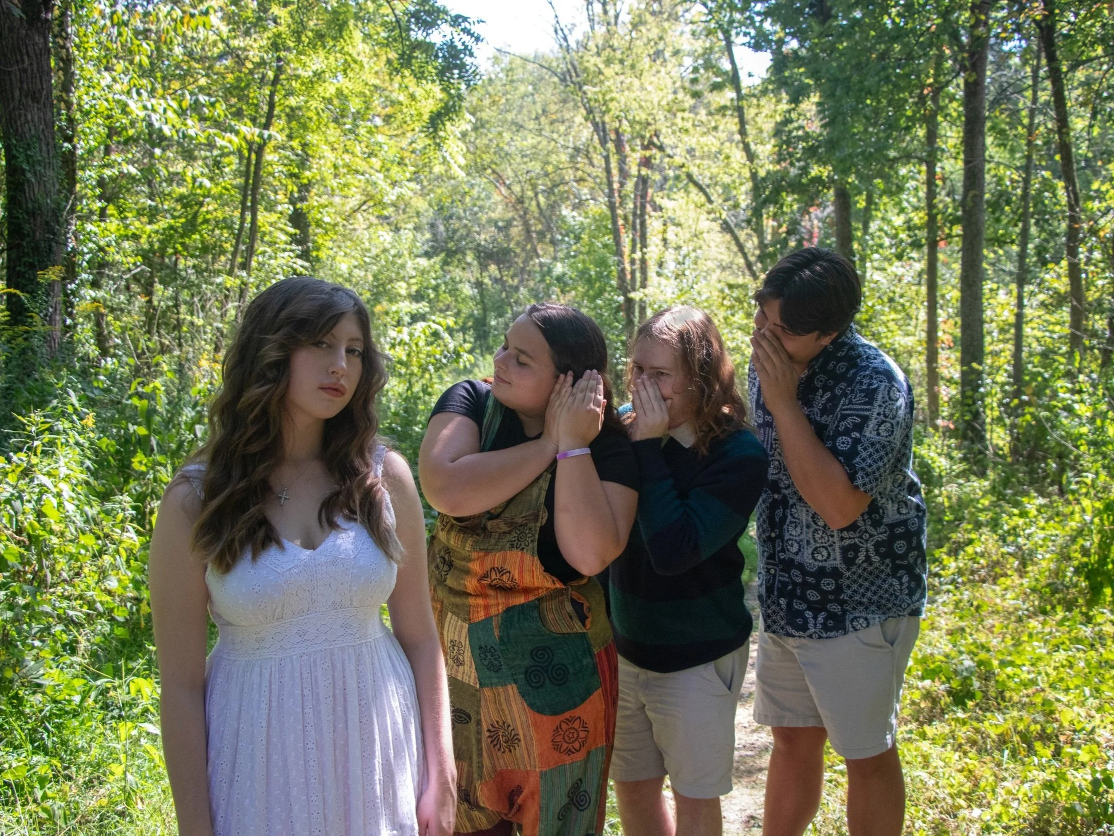
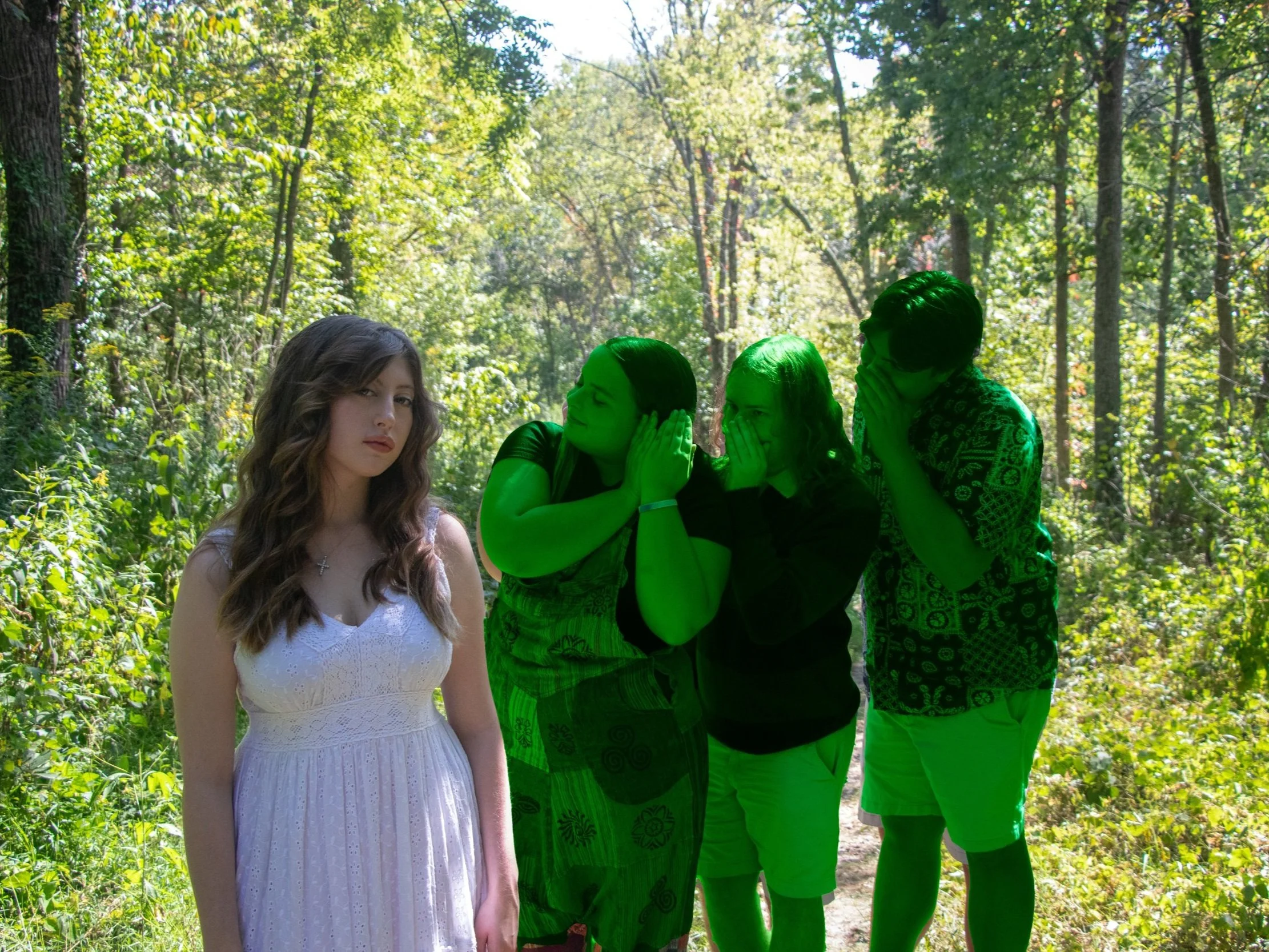
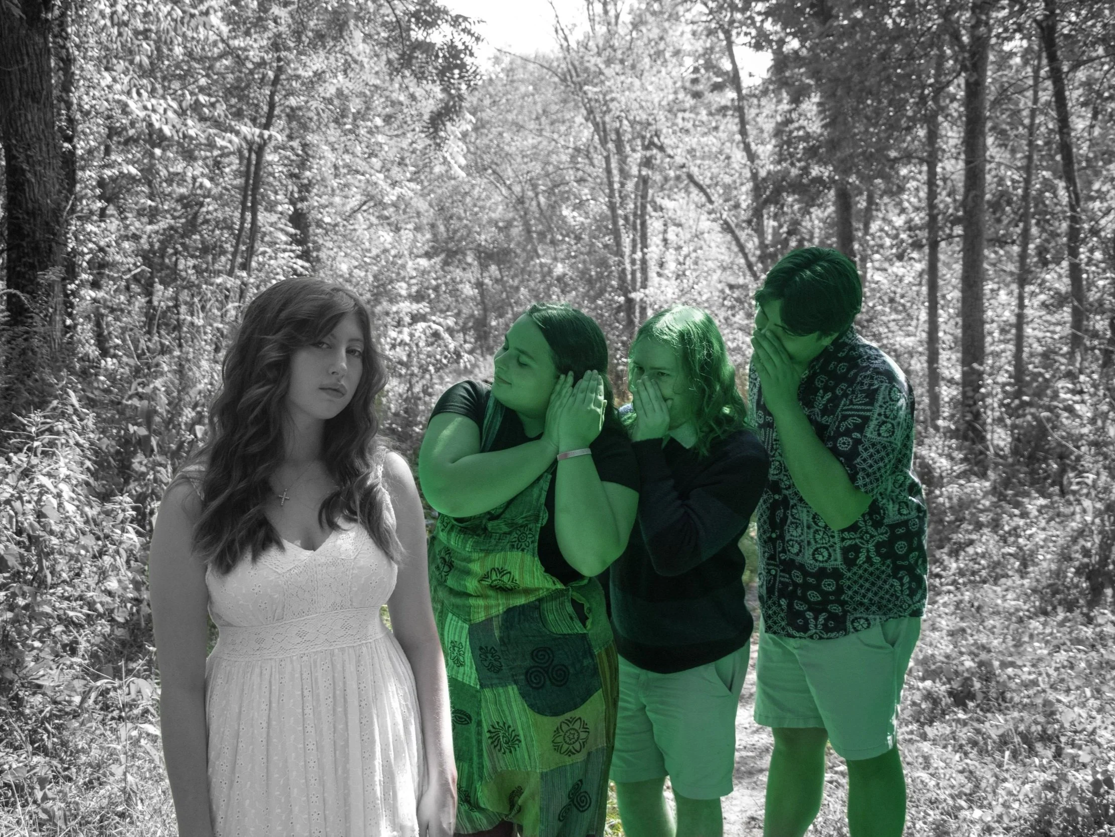
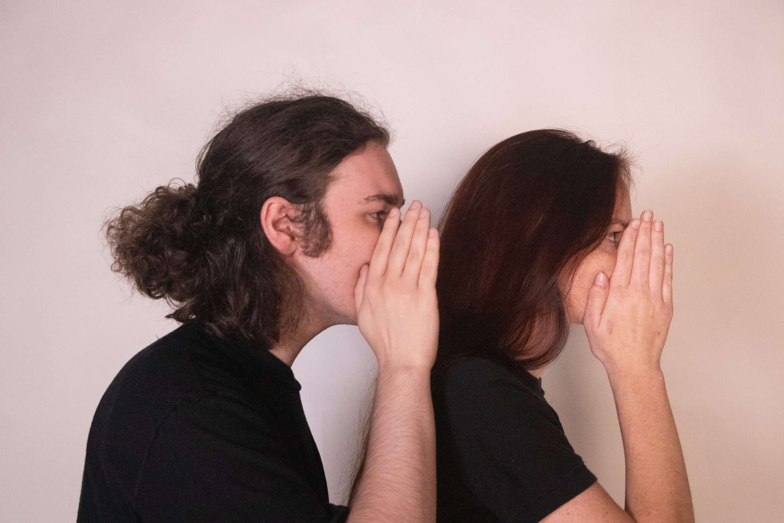
Below is a photographic representation and experiment of the two concepts shown above. The first experiment involved color play and grades while the second experiment was a very modern and simple take on the project.
Photos into Photoshop
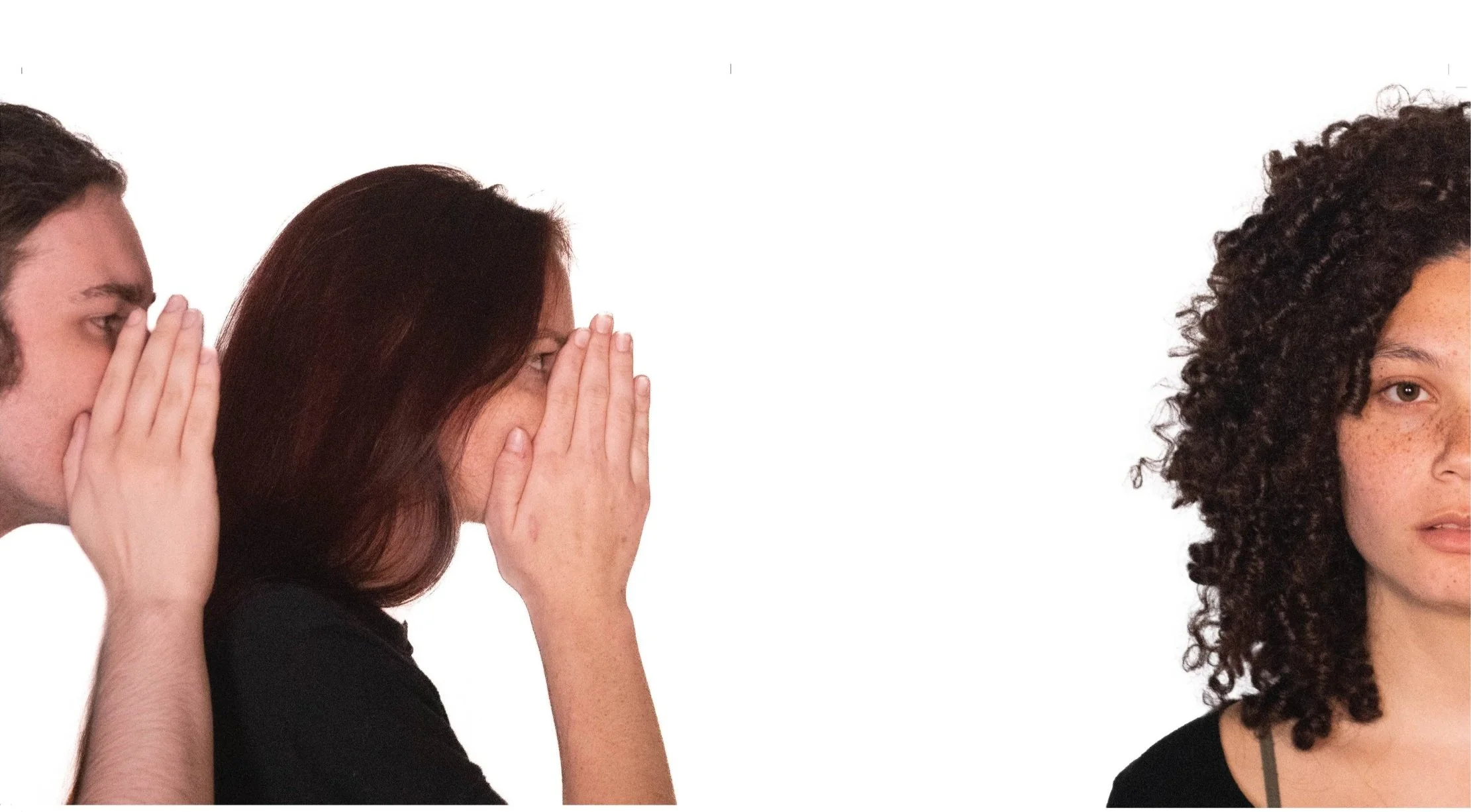
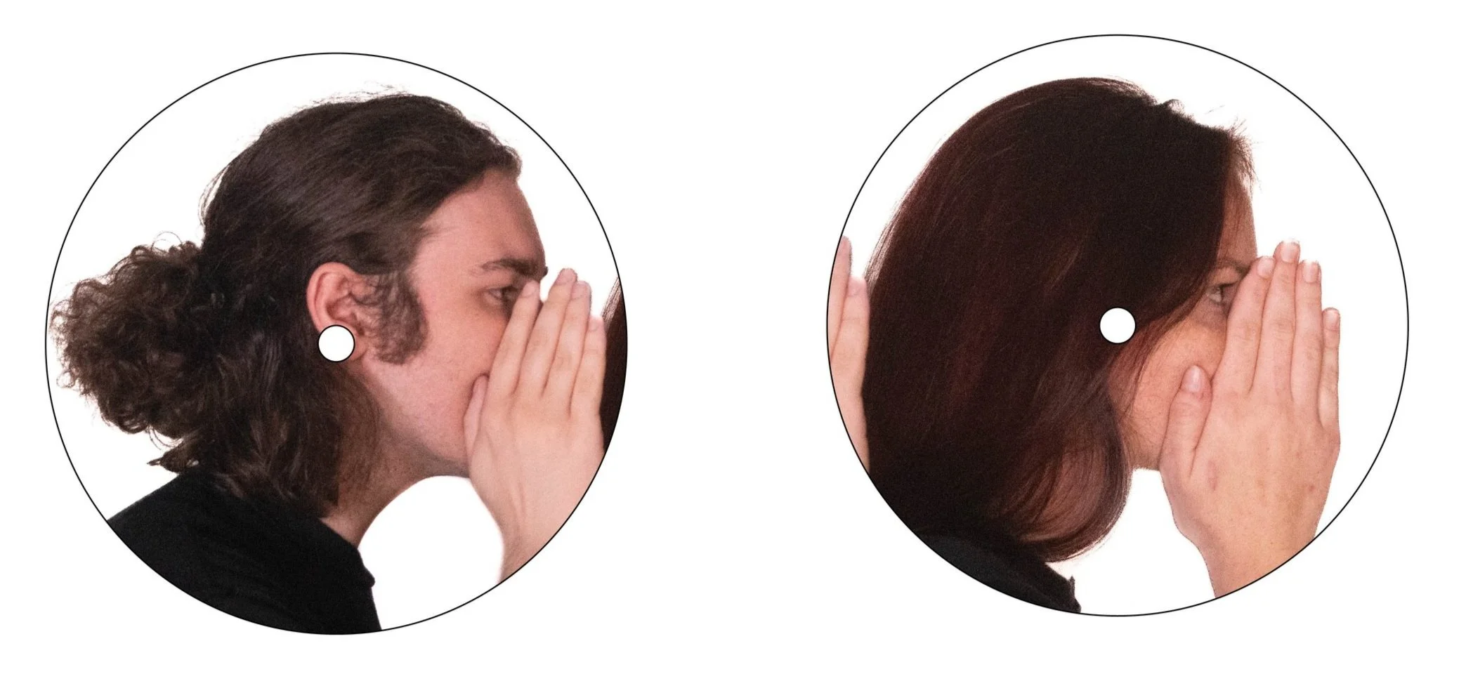
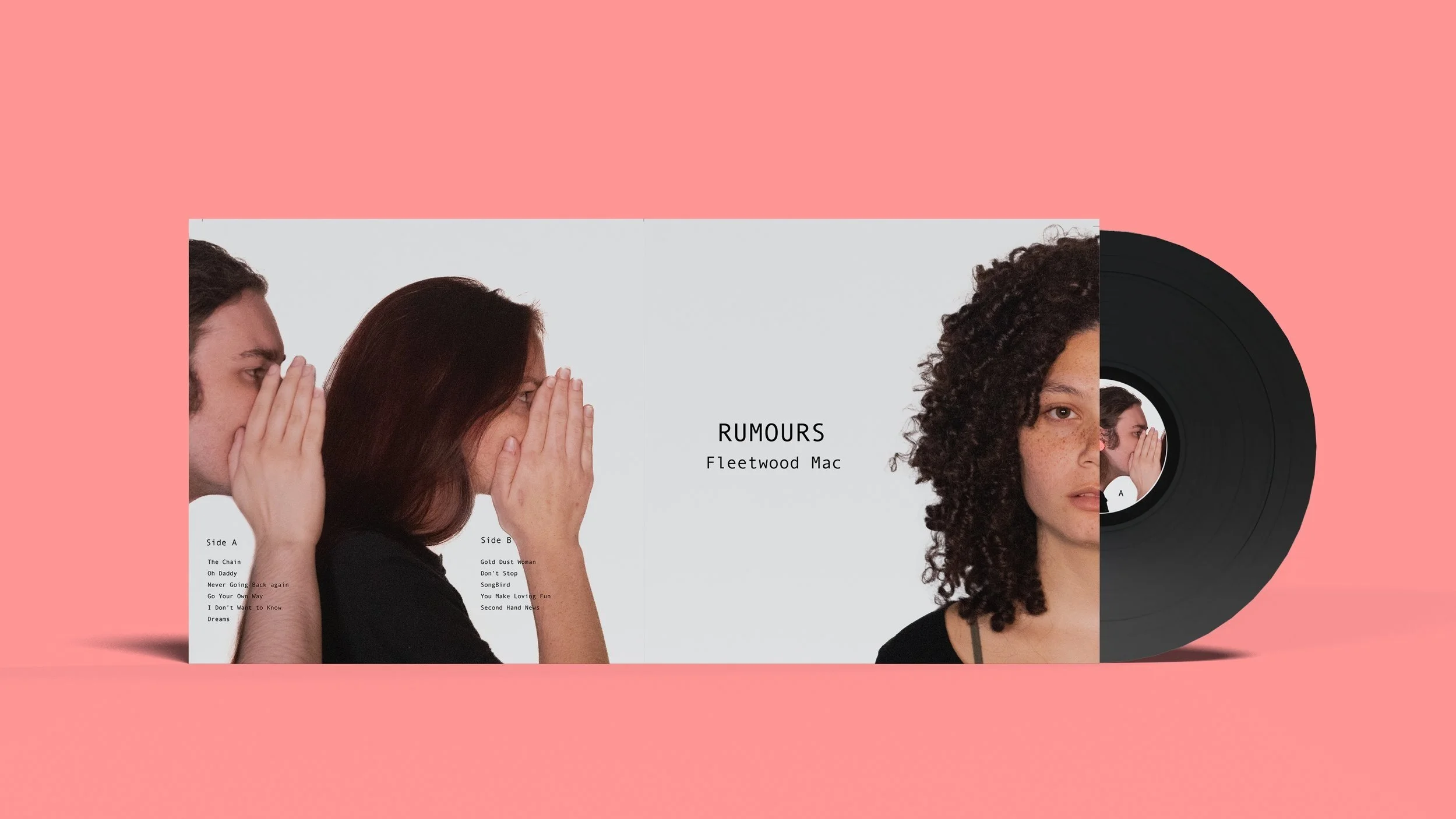
With a concept decided the photos were then taken to illustrator to create the full layout of the album. This include the back spread, center fold, and the center stickers for the actual vinyl.
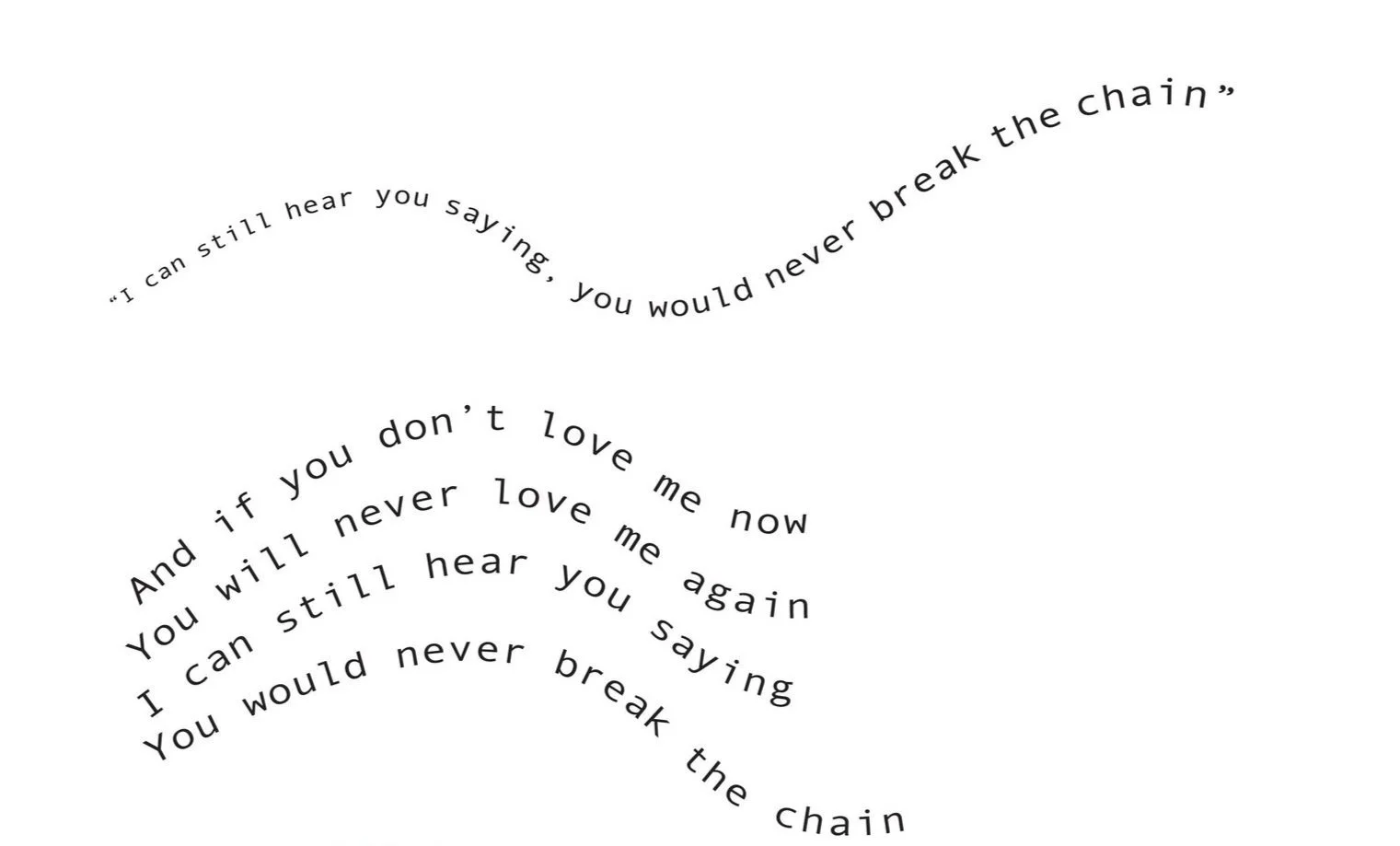
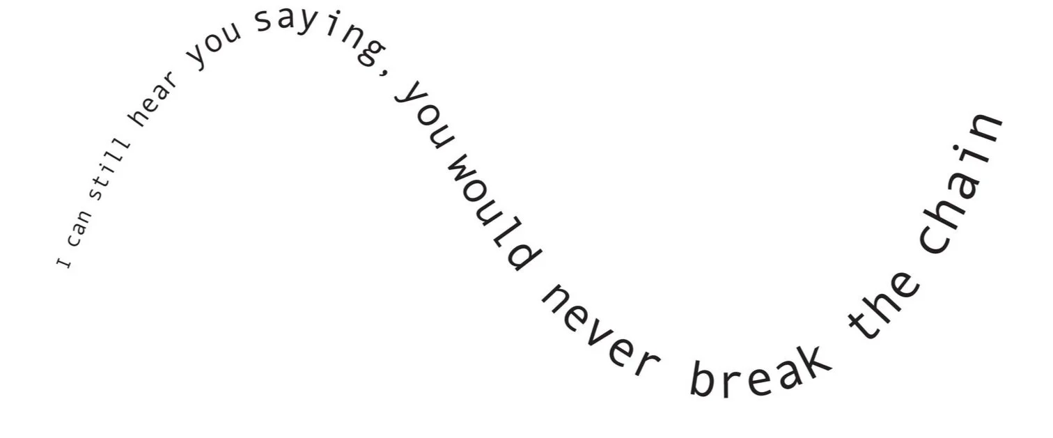
Experimental Typography
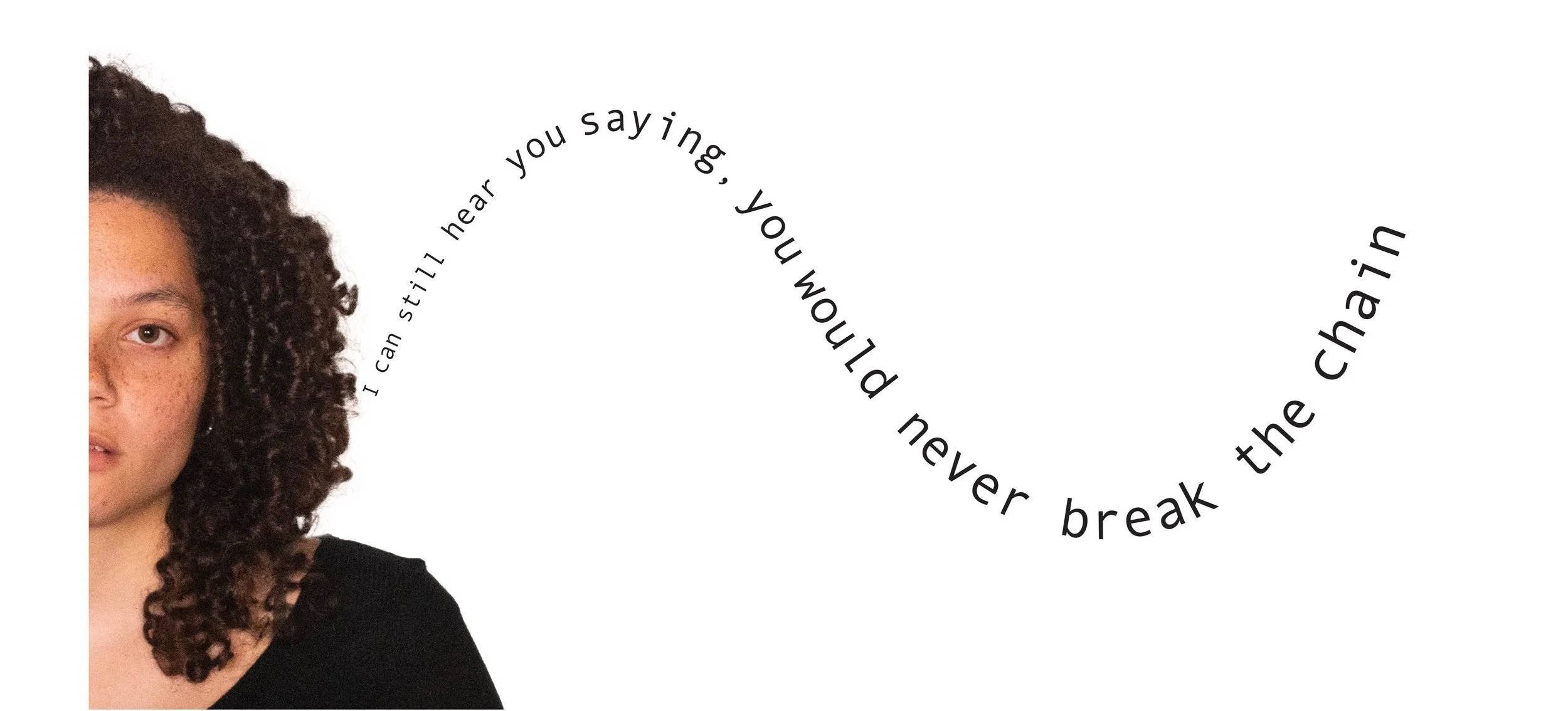
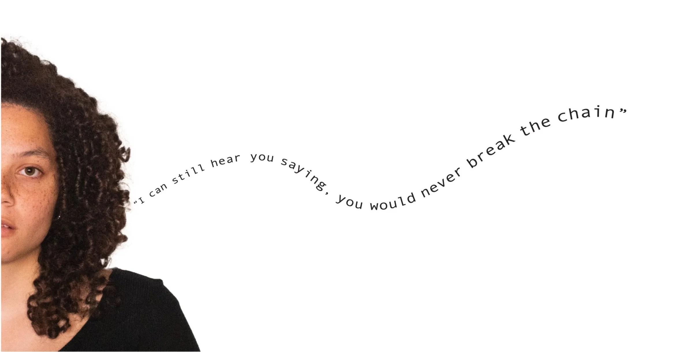
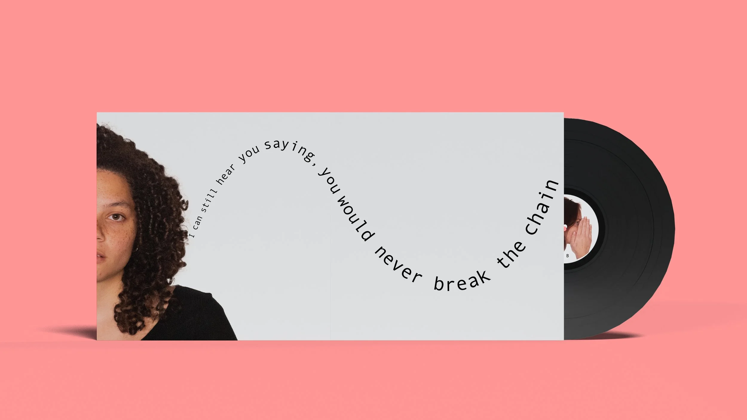
Type play was used to represent sound waves coming out of the subjects other ear in the centerfold of the album. The size was the main focus here.
Ideas to Critique
Applying the type play to the imagery and settling on two different variations.
Final Decision
Final Deliverable
For the final deliverable, the outside layer consisted of an acetate packaging with the type on it. This was used to symbolize that rumors themselves are most of the time false and not a defining characteristic of our personalities.
